The New Design of Starbucks stores and my Opinion!
I’ve been examining Starbucks and their marketing, design, and product offerings for the last few days. And I ended up on the Starbucks design page!

And as I went through it, I felt it deserved its own blog to describe what their new design approach will be and how I see it as an architect. Let’s keep this read short! Don’t wanna bore you off.
Starbucks outlets are serving more people than ever before, with consumers frequently ordering via their phones rather than at the counter. The menu has expanded from a few drinks to dozens, with businesses designed primarily for hot beverages unable to accommodate the demand for more personalized cocktails and cold beverages. And food is becoming an increasingly essential component of the mix; what was previously a case of just breakfast pastries is now a food platform with hot sandwiches accessible all day.
“Today we find ourselves at another unique moment; a moment that challenges us to reinvent and think differently,” John Culver, group president, North America and chief operating officer.
Next year, Starbucks will invest an incremental $450 million in North America. The company plans to add 2,000 net new stores in the U.S. by 2025, diversifying the portfolio of stores across cafes, pick up stores, drive thru-only, and delivery-only locations to meet Starbucks customers whenever and wherever they want.
DESIGN
But what is the new design gonna be like?
The answer is “Community Stores”


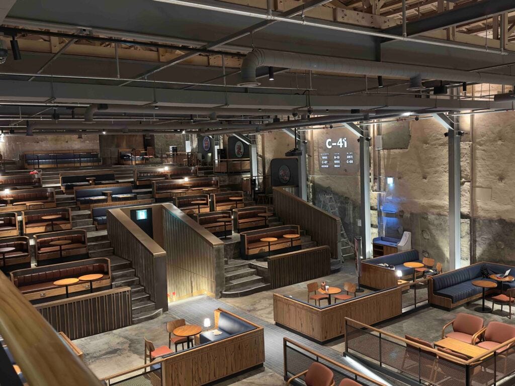
Starbucks opened its fifth Community Store in Seoul, South Korea. The beautiful store is within a redesigned theater at the historic Kyungdong market, offering a new opportunity for community members to engage with the brand in a known and beloved location. The spacious and unique store interior pays tribute to the historic theater with a retro touch of 1960s style and modern design elements, providing customers their favorite tastes of today with a feel of the past.
OPINION
This, in my opinion, might be the best way ahead! Designers of Apple Stores had the same objective.
Because customers are ordering more through mobile apps and internet these days, these businesses may be more than merely sit-drink-go establishments. There may be an experience that provides customers a whole new cause to come and enjoy the environment of these establishments, practically offering another extra reason for spending hours at the café and finding reasons to return more often.


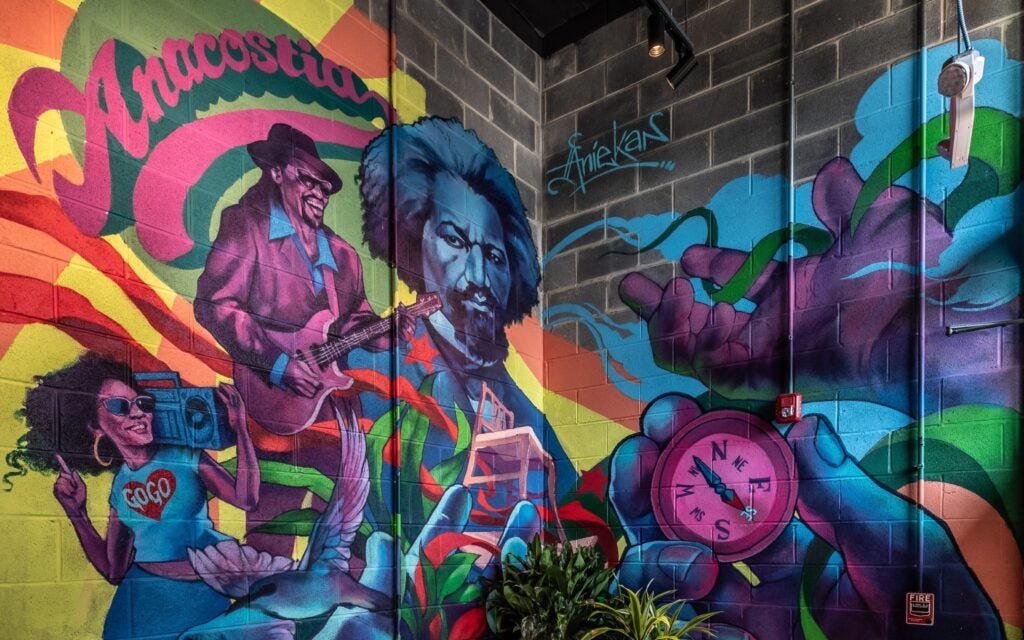
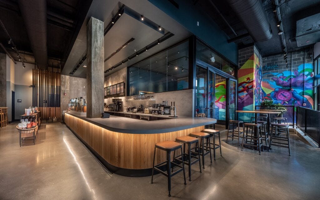
For example, Starbucks Community Store in Washington, D.C.’s historic Anacostia area has a vibrant, expansive mural that draws inspiration from the region. Aniekan Udofia’s artwork depicts the city skyline inhabited by historical figures and icons beloved by the community.
This allows people to engage with more than just their coffee and we all know that coffee and tea is a great way to start conversations!
So a golden move by the designers and marketing experts! But, Let’s see how Starbucks makes these community stores global!
